Studio

Brand & Editorial Design

Before I designed products, I photographed people. Eleven years of editorial and fashion photography taught me how type, color and negative space carry a mood, and I still start every layout there. This page is the visual side of my practice: the Multitouch Studio brand, and three website systems we designed for it, each built as a small brand with its own type, palette, grid and tone.

Multitouch Studio

Multitouch was a studio I ran with my partner, Elli Raynai. We both came to web design and development from creative backgrounds, and we built websites and online stores for small and mid-size businesses on Squarespace and Shopify. The brand below is how we defined what we stood for, how we looked and how we spoke to clients.

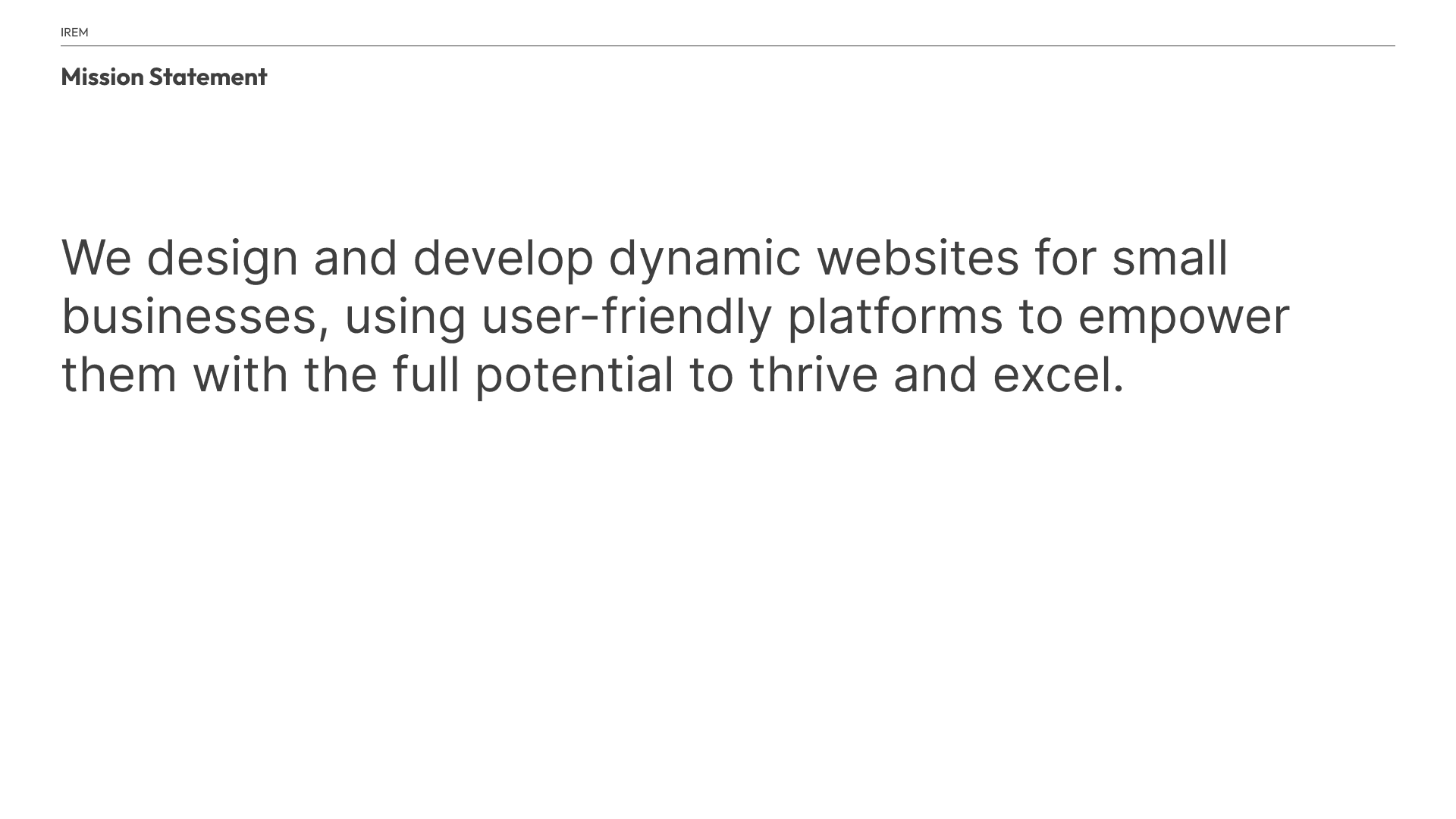
Multitouch brand deck slide, Mission Statement: We design and develop dynamic websites for small businesses, using user-friendly platforms to empower them with the full potential to thrive and excel.
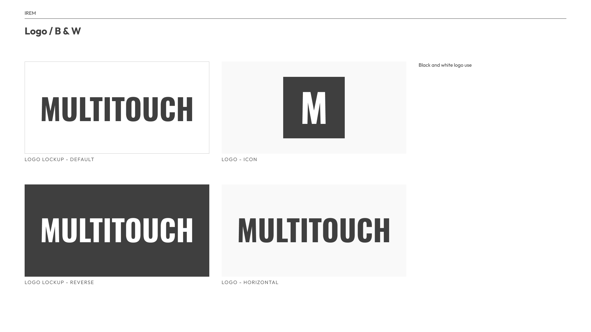
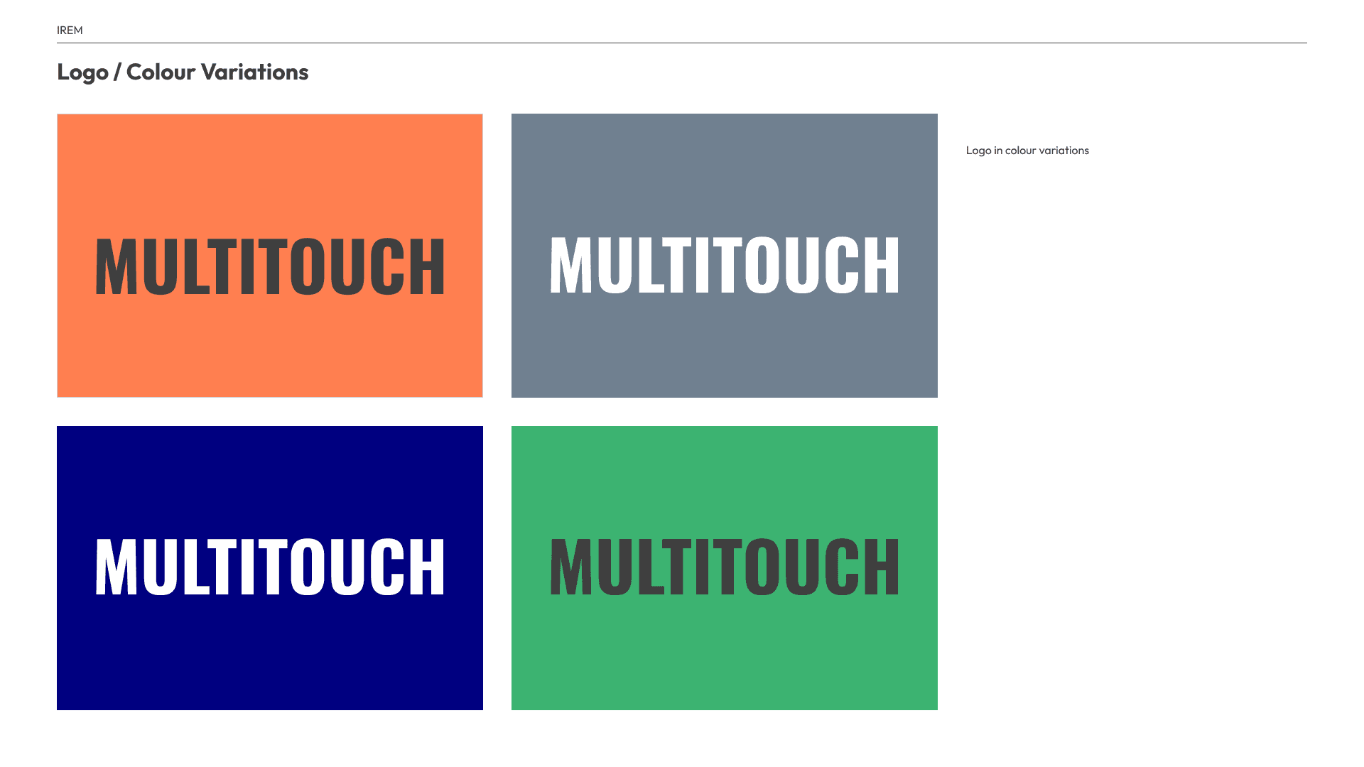
Multitouch logo in black and white: the condensed MULTITOUCH wordmark as default and reverse lockups, a square M icon, and a horizontal version.The condensed MULTITOUCH wordmark on coral, slate, sapphire and mint backgrounds, in dark grey or white type.
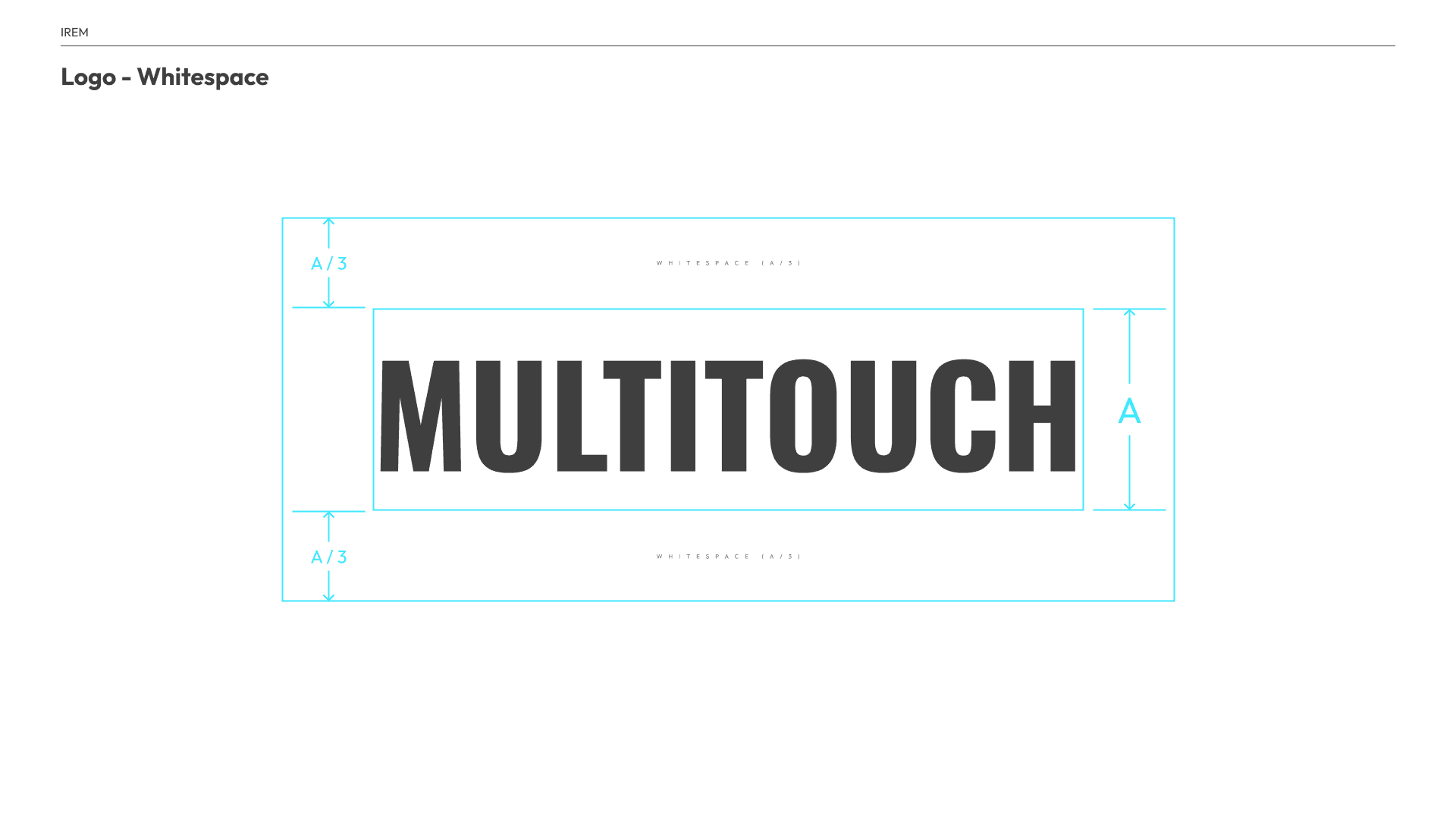
A condensed wordmark, an M icon, and reverse and horizontal lockups, with clear space based on the logo height.
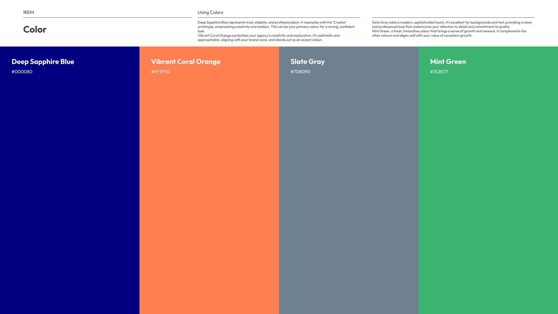
Multitouch palette slide with four tall columns: Deep Sapphire Blue #000080, Vibrant Coral Orange #FF7F50, Slate Gray #708090 and Mint Green #3CB371.
Sapphire for trust, coral for energy, slate and mint to keep it calm.
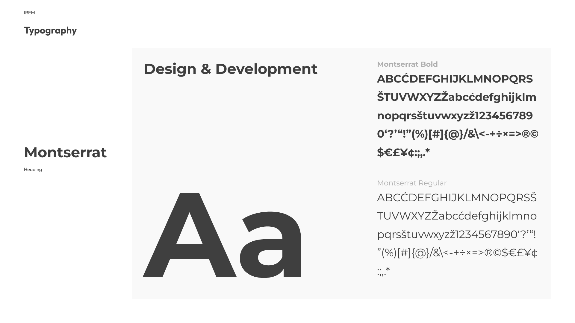
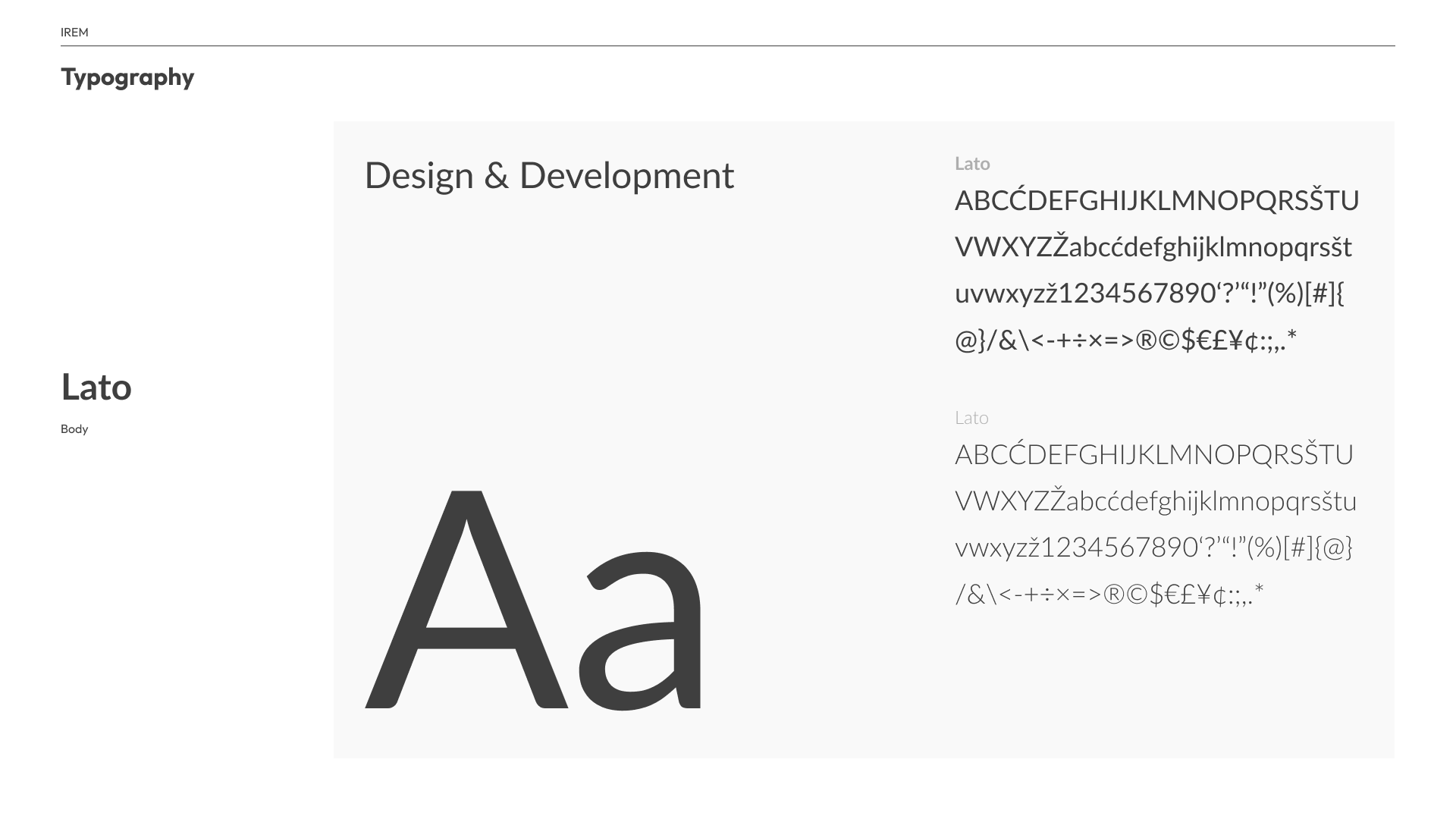
Typography slide for Montserrat, the heading face: a large Aa, a Design and Development sample line, and bold and regular character sets.Typography slide for Lato, the body face: a large Aa, a Design and Development sample line, and regular and light character sets.
Montserrat for headings, Lato for body.
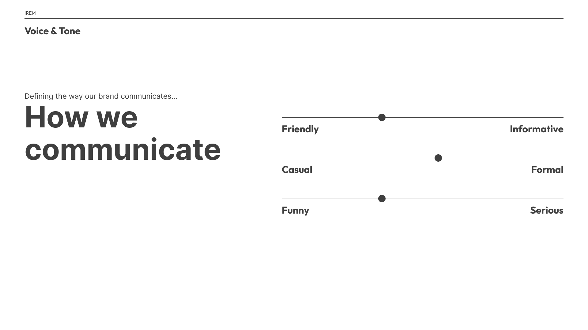
Voice and tone slide titled How we communicate, with three sliders placing the brand toward friendly over informative, near the middle between casual and formal, and toward funny over serious.
Friendly, a little funny, and balanced between casual and formal.
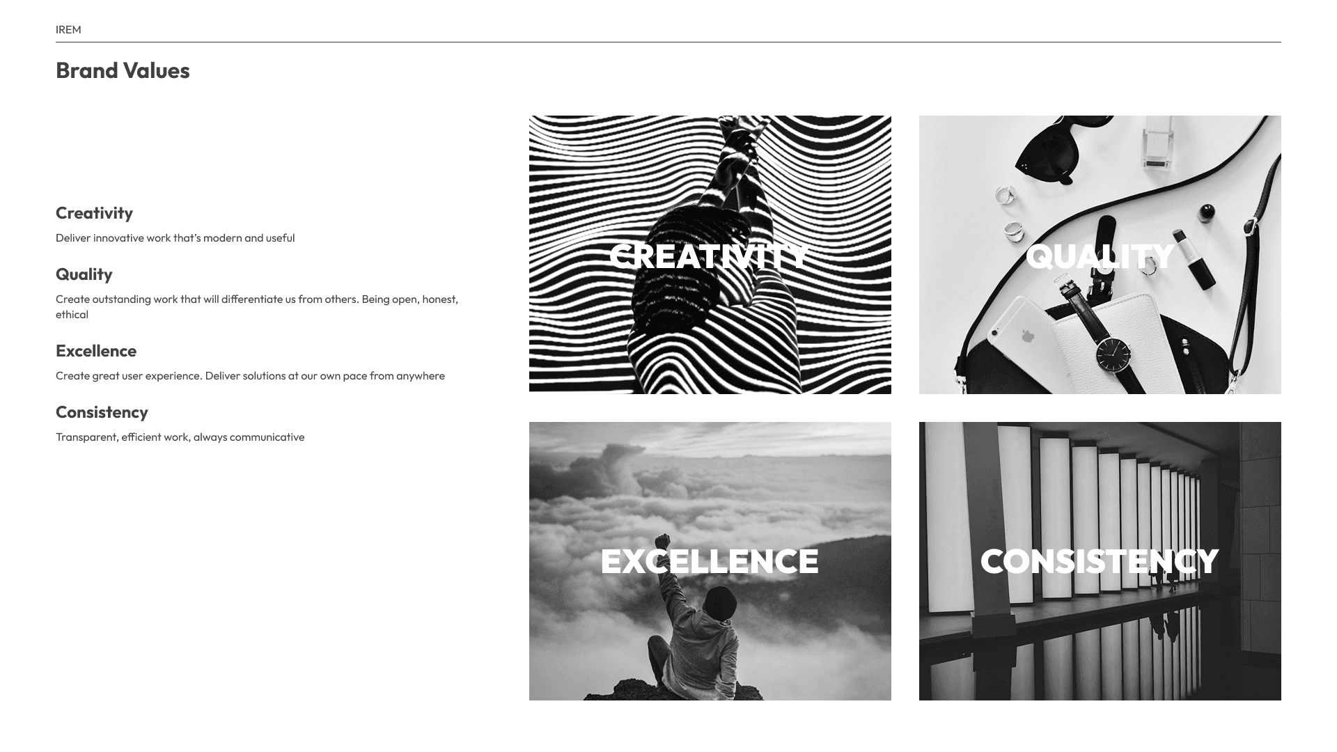
Brand values slide listing Creativity, Quality, Excellence and Consistency with a short line each, beside four black and white image tiles, each overlaid with its value in white caps.
Four values that came from our backgrounds as creatives who moved into design and development.
Logo clear space diagram: the MULTITOUCH wordmark at height A, with whitespace of A/3 above and below.

Alba

A calm, personal system for wellness coaches and practitioners.
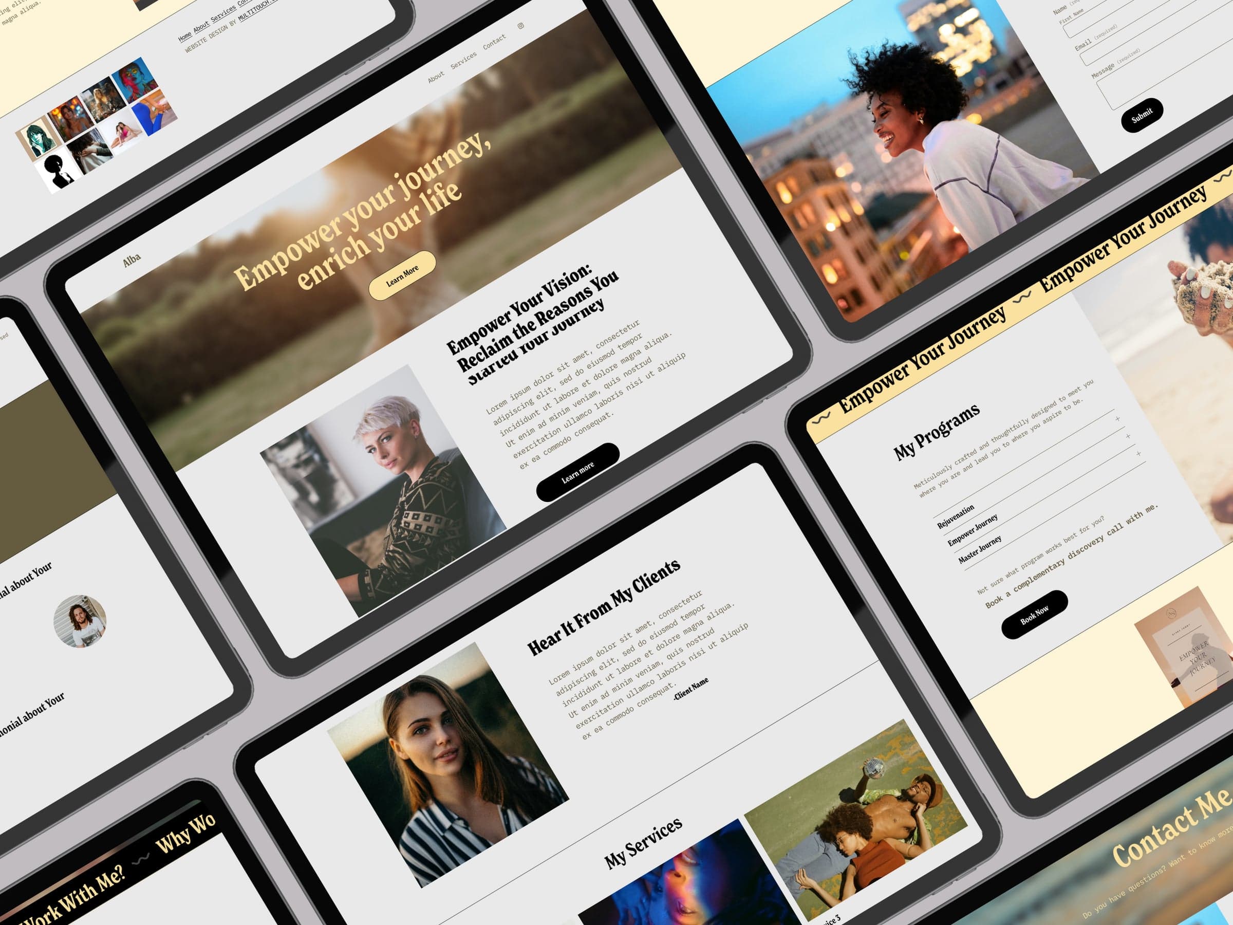
Angled collage of Alba template pages on tablets: condensed serif headlines, small monospace body text, rounded black and butter yellow buttons, and a butter yellow marquee band.

Type

Display
New Spirit CondensedLicensed, shown from the screensNew Spirit Condensed specimen from the Alba marquee: Why Work With Me, in butter yellow on black.
Body
IBM Plex Mono

Aa Bb Cc Dd Ee 0123456789

Buttons
ClarksonLicensed

Color

  • Background#E9E9E9
  • Olive, text and band#655A3F
  • Butter accent#FBE19F
  • Cream section#FEF5D9
  • Ink#000000

Layout

Condensed serif over a monospace body, color-blocked in olive, butter yellow and cream, with a scrolling marquee band as the divider.
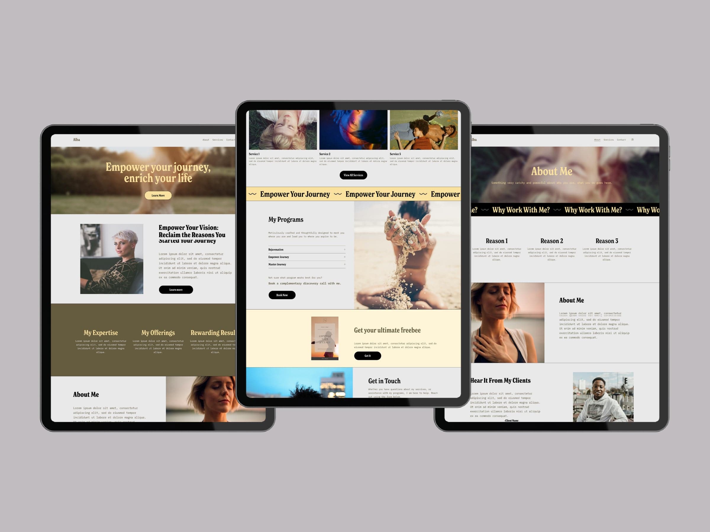
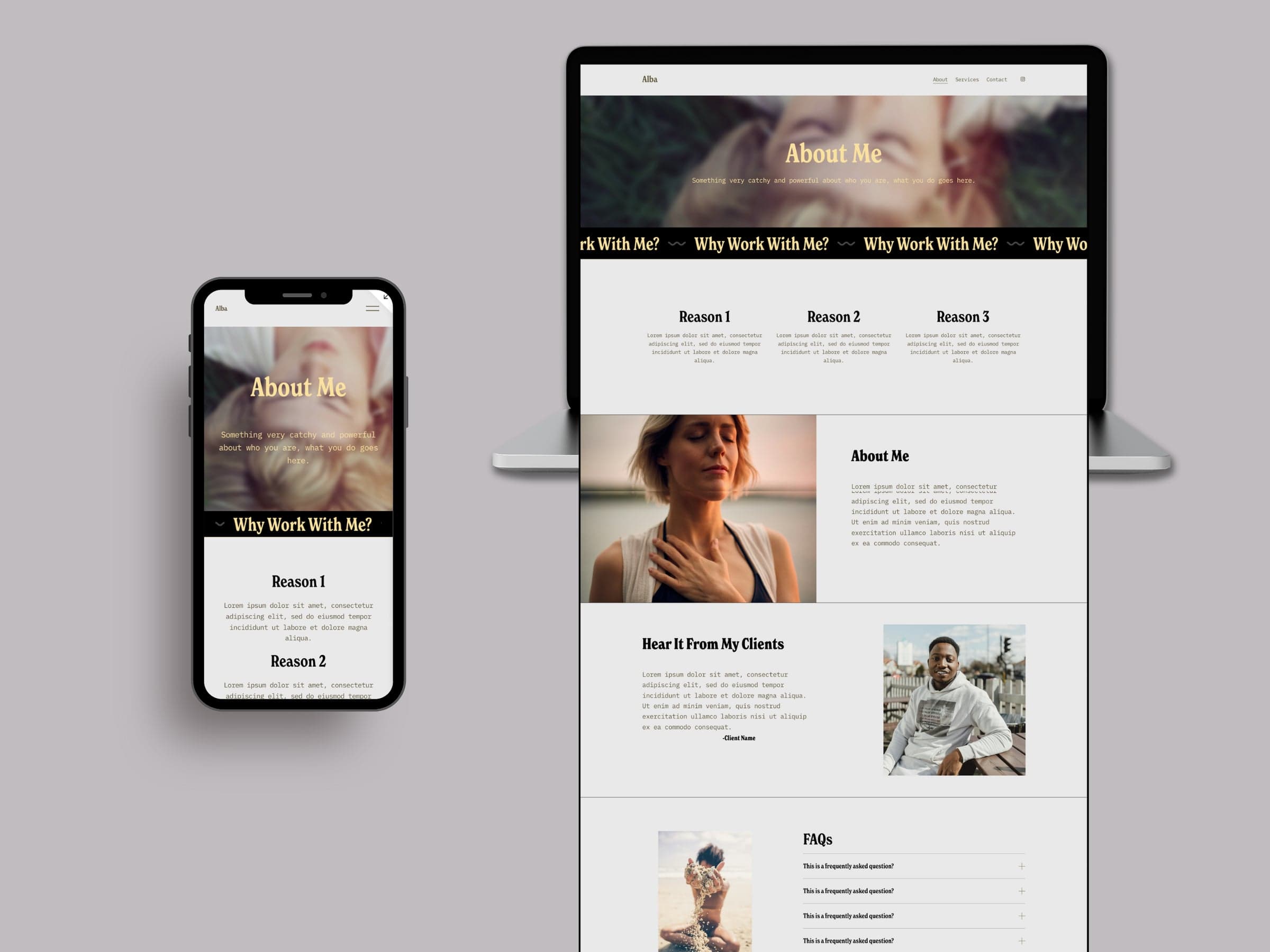
Three Alba pages on tablets: a home page with an olive feature band, a programs page with a butter yellow marquee and a cream freebie section, and an about page with a black marquee band.The Alba about page on a phone and as a full-length desktop page: a condensed serif header, a black marquee band, a three-column reasons grid, split image and text rows, and an FAQ list with hairline dividers.

Archived template. Site no longer live.
Mackenzie

A bold, photo-first system for photographers and visual creatives.

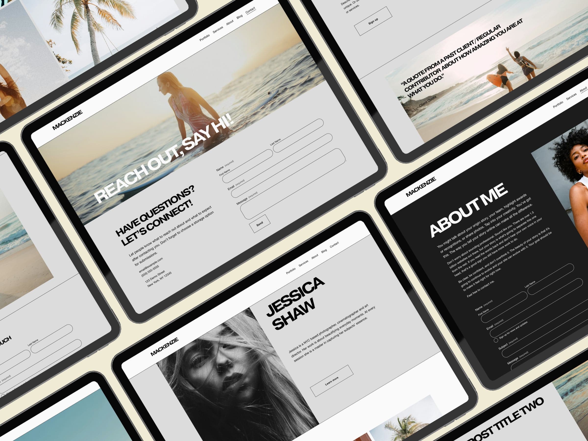
Angled collage of Mackenzie template pages on tablets: wide, tightly tracked grotesque caps, hairline rules, outlined buttons and rounded form fields on grey and near-black sections.

Type

Display
Pragmatica ExtendedLicensed, shown from the screensPragmatica Extended specimen from Mackenzie: SELECTED WORKS in wide, tightly tracked black caps.
Body
Helvetica NeueLicensed, shown from the screensHelvetica Neue specimen from Mackenzie: three lines of small black body copy on grey.
Buttons
ClarksonLicensed

Color

  • Background#FAFAFA
  • Section grey#DCDCDC
  • About panel#1C1C1C
  • Text#000000

Layout

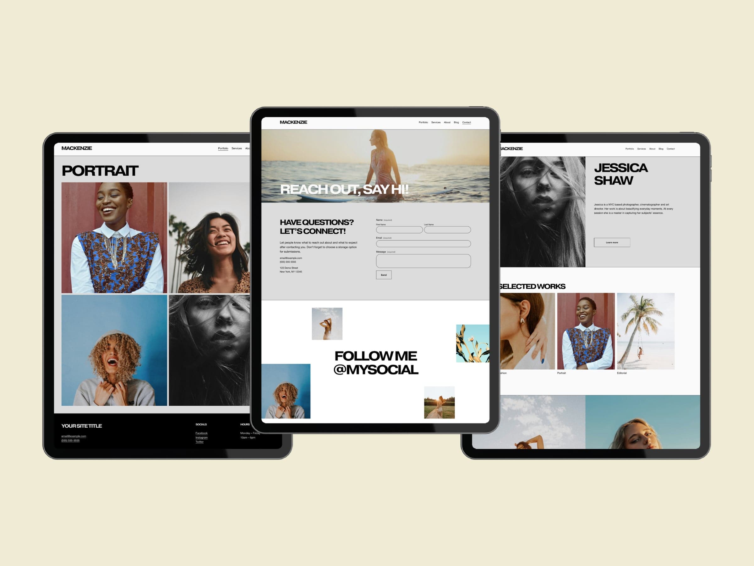
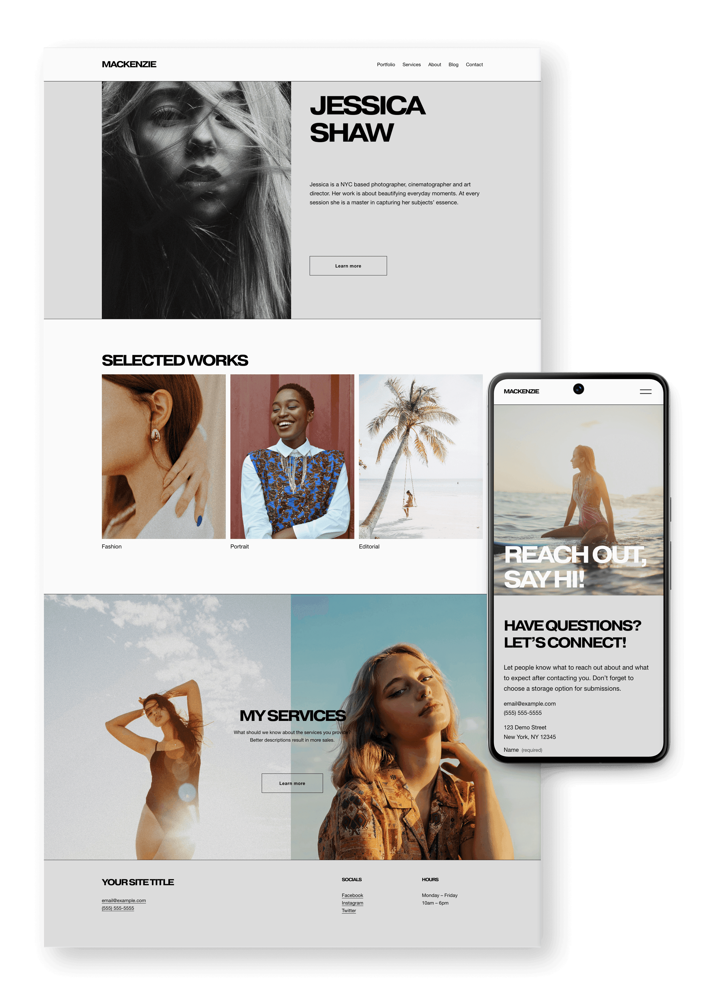
Wide, tightly tracked grotesque caps on a flat grey and white grid, with hairline rules and outlined buttons. The photography carries the color.

Three Mackenzie pages on tablets: a two-by-two portrait gallery above a black footer, a contact page with a full-bleed header and an outlined form, and an about page with a selected works grid.The Mackenzie home page at full desktop length beside the contact page on a phone: wide caps headlines, a grey split hero, a three-column selected works grid with small labels, and a grey footer.

Archived template. Site no longer live.

Angela

A soft, editorial system for wedding and portrait photographers.

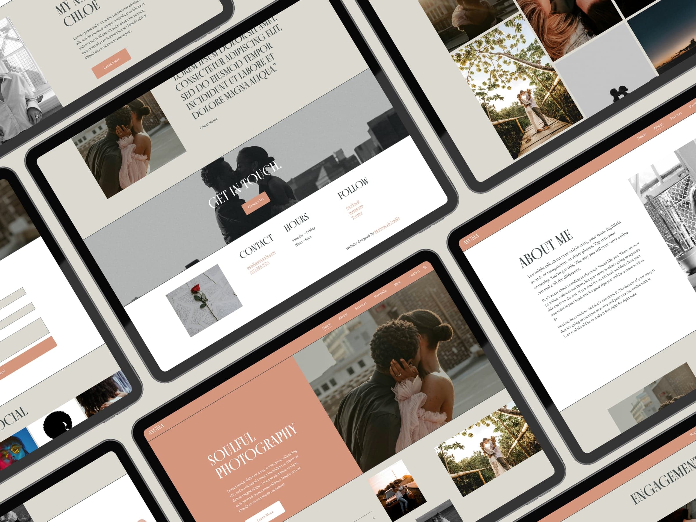
Angled collage of Angela template pages on tablets: tall uppercase serif headings, terracotta header bands and buttons, and warm grey content blocks.

Type

Display
FinoLicensed, shown from the screensFino specimen from Angela: HAVE QUESTIONS? in tall white uppercase serif on terracotta.
Body
Spectral

Aa Bb Cc Dd Ee 0123456789

Buttons
ClarksonLicensed

Color

  • Background#FFFFFF
  • Terracotta band#D4967D
  • Warm grey block#DCD9D0
  • Text#3F4A49

Layout

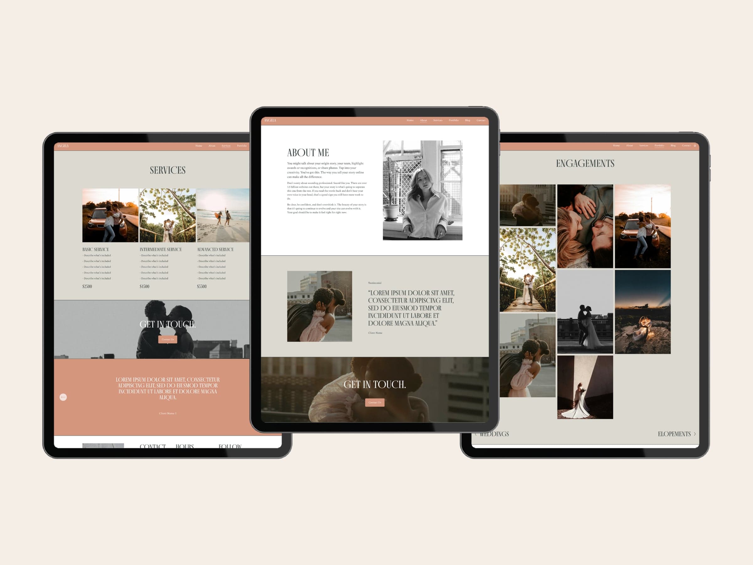
Tall uppercase serif over a Spectral text face, with a terracotta header band and soft grey blocks. Quiet and editorial.

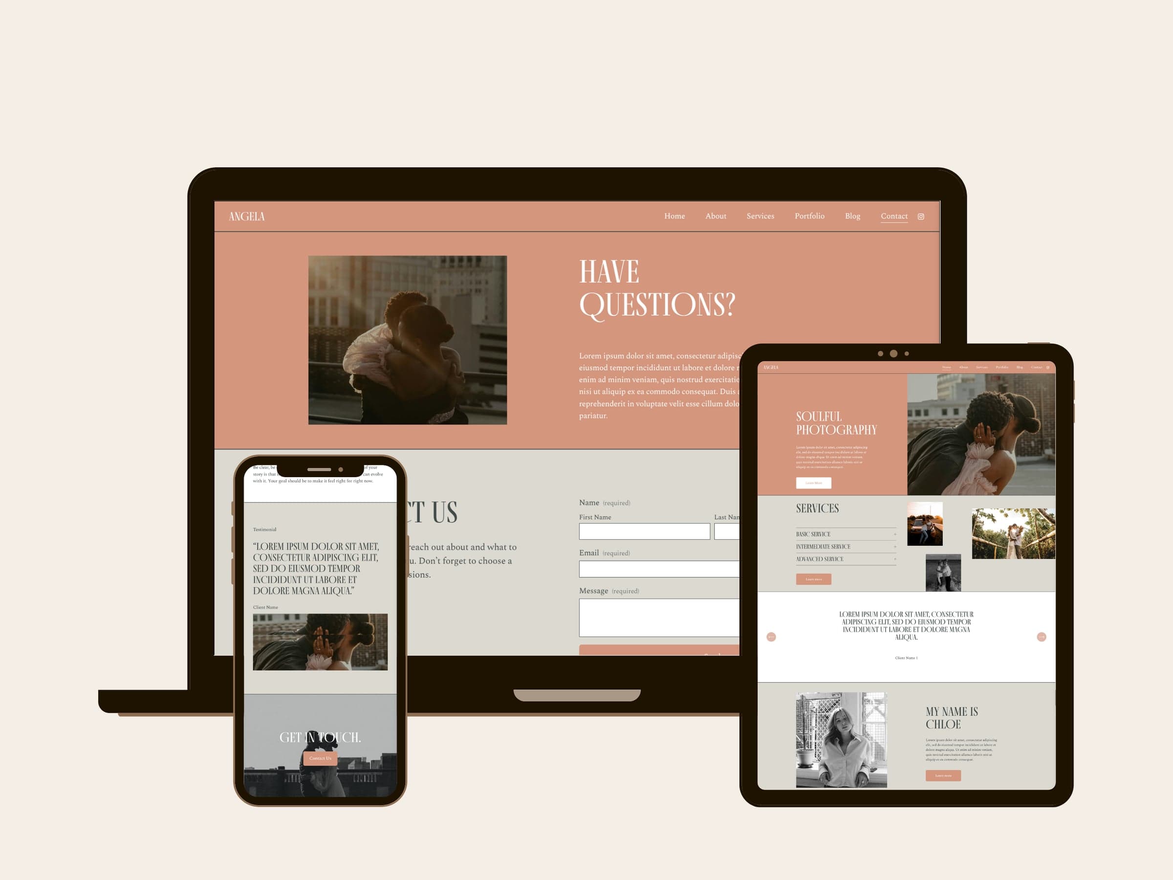
Three Angela pages on tablets: services in three priced columns, an about page with a serif testimonial on warm grey, and an engagements gallery in a staggered grid.Angela on a laptop, tablet and phone: a terracotta contact header with a tall serif headline, a services list with hairline dividers, and a centered serif testimonial.

Archived template. Site no longer live.

Looking for product work instead? Read the case studies, or get in touch.