Snapchat - Snap AR

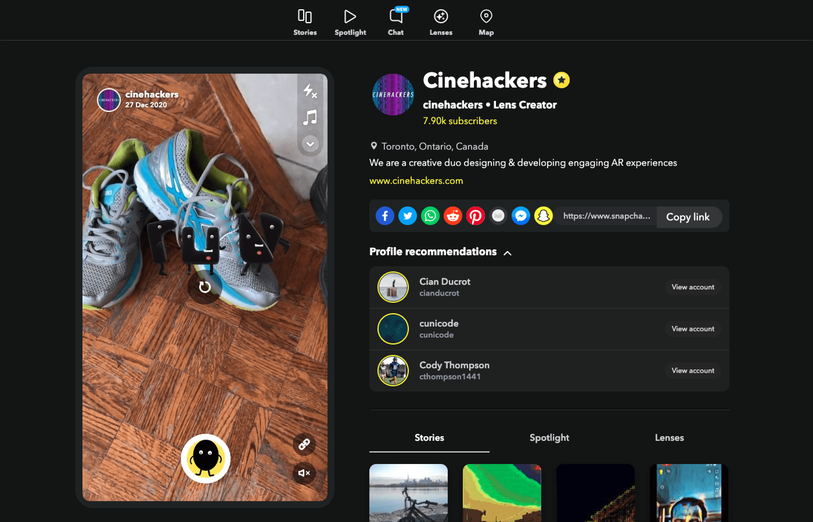
Nourish is an uplifting AR experience developed for Snapchat, conceived and executed as part of an exclusive AR residency program. An engaging lens for establishing healthy habits.

BMO, Bank of Montreal is a Canadian multinational investment bank and financial services company. The bank was founded in Montreal, in 1817, it is Canada's oldest bank.

Gateway 2.0 is investment platform by BMO aimed at high-income investors in their 50s& 60s with accounts that are managed by Investment Advisors.

As the Lead Product Designer at BMO, I orchestrated collaborative efforts in modernizing the investment platform with a diverse, cross-functional team as well as liaising with additional external teams.

My role was pivotal in achieving a 71% improvement overall user experience and 63% platform usage increase through the design & deployment of several key features such as E-Documents.

PROCESS

Research > Alignment > Prototyping > User Testing > Iteration > Final Buy-in > Delivery

GOAL

Achieving regular feature rollouts to strategically modernize the legacy platform across both mobile & web interfaces, driving increased user engagement & satisfaction and promote mobile app adoption. This way, reducing user pain points, frustration and offering a better user experience. 

CHALLENGE

I took over leadership of a project with a complex landscape, marked by a multitude of stakeholders with divergent visions. Development teams were working in silos on disparate features, and there was a conspicuous absence of initial discovery sessions to solidify requirements and product vision. 

Adding to the complexity, the design team was often brought in to the process late, and we were also tasked with aligning our platform's aesthetics and functionalities with another existing platform

Lastly we didn't have access to real user feedback.

This multifaceted challenge required a strategic approach to bring coherence and direction to the project. So: 

- To foster communication, we initiated alignment sessions with our business partners for continuous feedback. 

- In collaboration with our research team, we initiated a process to build a user panel to gather real-time user insights.

- We engaged in recurring design sessions with the other investment platform's team to collaboratively develop and adopt a unified design system.

DISCOVERY/ RESEARCH

In the initial brainstorming sessions, we explored various approaches to motivate users, but the concept truly crystallized when we envisioned characters that reside invisibly in one's personal space, awaiting activation via scanning specific items.

After doing a tech feasibility research, we decided to leverage ML models together with Snap developers. This way we enabled an environment-sensitive interactivity.

Through our secondary research about people's motivational pain points and activities that promote healthy habits we decided to focus on nutrition, exercise and sleep. ​​​​​​​

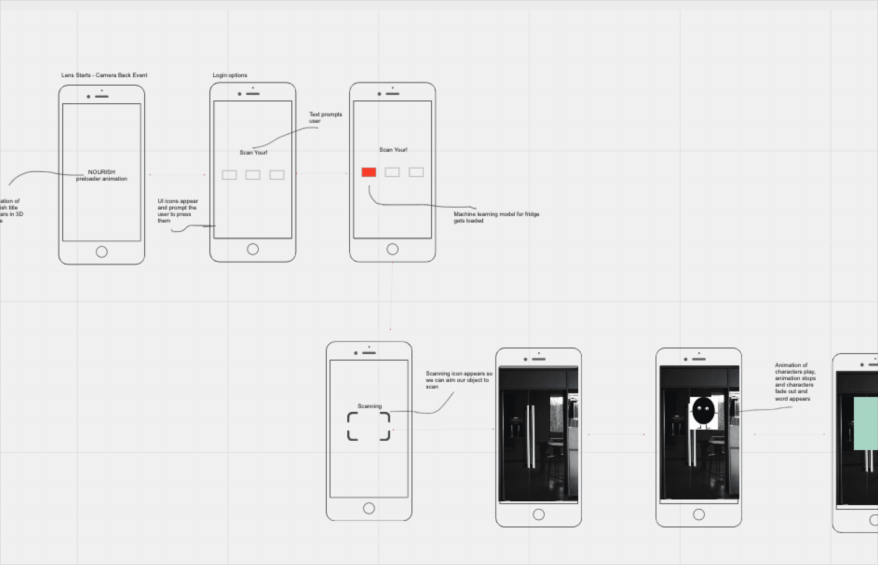
USER FLOW & WIREFRAMES & PROTOTYPE

In pursuit of an intuitive and captivating user experience, we meticulously crafted a series of wireframes to visualize the lens' flow.

Recognizing that we had mere seconds to engage the user's attention, these wireframes served as essential blueprints.

To further refine our concept and secure developer buy-in, we constructed a prototype that vividly illustrated the lens's intended user journey, thus solidifying our design process.

ASSETS & INTERACTIONS

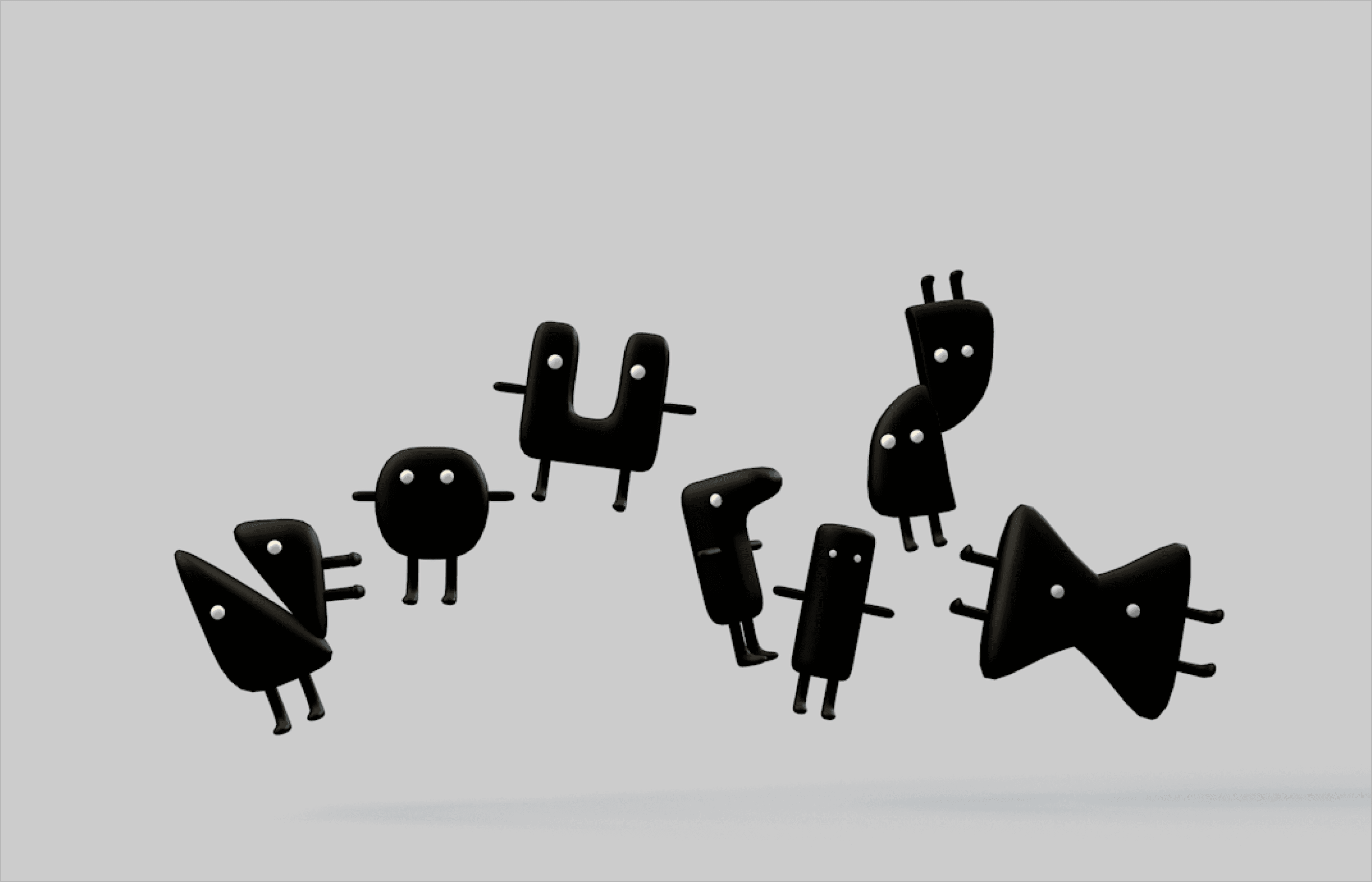
We initiated the creative process by sketching out characters, each designed to represent motivational words associated with our project's thematic subjects. Our initial choices - "Achieve", "Dream" and "Commit" - prompted us to realize the need for created and animating an extensive roster of characters. To streamline the process, we decided to derive words directly from our project's title, "Nourish", settling on "Rise", "Sense" and "Run" and built them in Cinema 4D.

Recognizing our limitations in character animation and rigging, we collaborated with Flipside XR, utilizing their creator tool Flipside Studio - a specialized tool for VR-based motion capture. You can see the characters animated here.

POLISHING & PUBLISHING THE LENS

Once we had our MVP,  we tested the lens with the internal team as well as a few selected users. We rapidly iterated based on feedback. 

After polishing the interactions and optimizing the animations we published the lens on Snapchat.

CONCLUSION

Throughout this project, I honed a myriad of problem-solving skills essential for impeccable design and user experience.

Our focus was on crafting an impactful experience that serves as a motivational companion, particularly during moments when maintaining healthy lifestyle feels challenging. 

Leveraging cutting-edge technology, we efficiently navigated the constraints of both time and resources. By expeditiously developing a Proof of Concept, we secured team buy-in without compromising our overarching vision.

We delivered on time, the Lens got a lot of positive feedback and as Official Lens Creators we continued to create engaging experiences.

Previous
Previous

Dark Slope- Lumeto

Next
Next

Cream Productions