BMO
Modernizing a Wealth Platform Through System-Level Usability Improvements
- Role
- Product Designer & UI Developer
- Tenure
- Nov 2021 – Jun 2025
- Scope
- High-net-worth investment platform modernization
- Environment
- Enterprise finance · Design system contribution · Component delivery
- Technologies
- Figma · HTML · CSS · Angular · Storybook
Context
BMO's wealth platform served a predominantly 55+ client base managing critical financial assets. Digital adoption was lagging, mobile engagement was low, and document retrieval created significant friction for users who needed to access and batch download multiple document types across tax years. Account preferences had not kept pace with modern interaction standards, creating additional support burden and eroding confidence in the platform.
The business case was clear. For a wealth management platform serving high-net-worth clients, friction at this level was not a minor inconvenience. It was a trust and retention risk. Modernization was prioritized to reduce that friction, improve digital adoption, and bring the platform experience in line with client expectations at that wealth tier.
Investment platform (Gateway) testing environment
Discovery
Mapping user behavior before redesigning the system
Direct access to end users wasn't available. BMO's client base, predominantly high-net-worth individuals 55 and older, couldn't be brought into a standard research process. That constraint shaped everything about how we approached discovery.
Instead of waiting for access we weren't going to get, we built a multi-source research model. WalkMe gave us in-product behavioral signals. Adobe Analytics surfaced where users were dropping off. And because advisors were the closest point of contact to real user behavior, we formalized that relationship into a recurring advisor panel, a structured bridge between the design team and the people actually using the platform day to day.
We layered event-based surveys on top of that, placed at specific moments in the experience to capture friction closer to where it was actually happening, rather than relying on retrospective feedback that often smooths over the details that matter.
The goal was to triangulate. No single source was reliable enough on its own. Together, they gave us enough signal to identify where the platform was creating confusion, where trust was at risk, and which workflows needed the most attention.
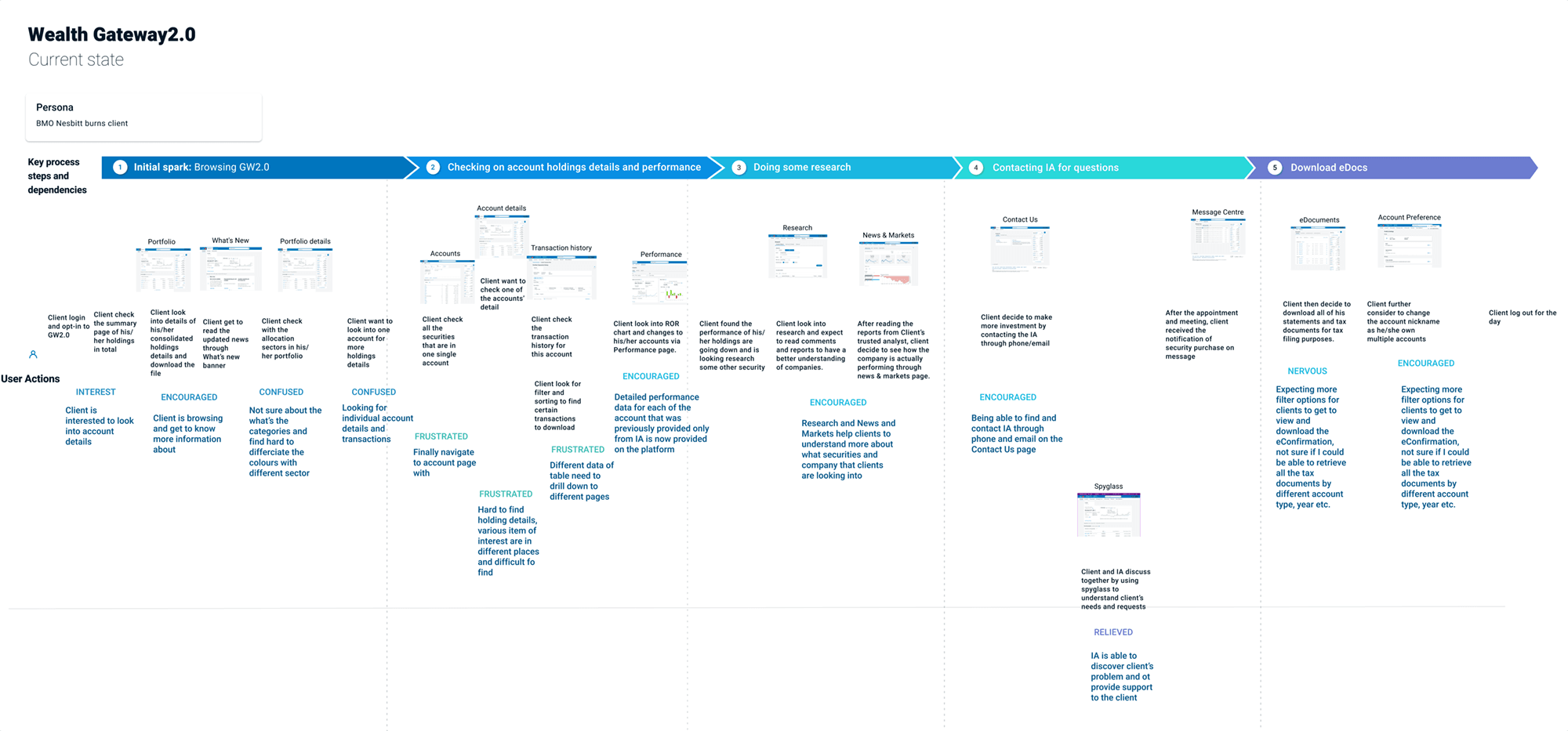
Journey mapping used to identify friction, drop-off points, and opportunity areas across a core platform flow.
Event-based surveys gave us a lightweight way to capture contextual feedback in the flow itself, making it easier to compare in-the-moment friction signals against advisor feedback and analytics patterns.
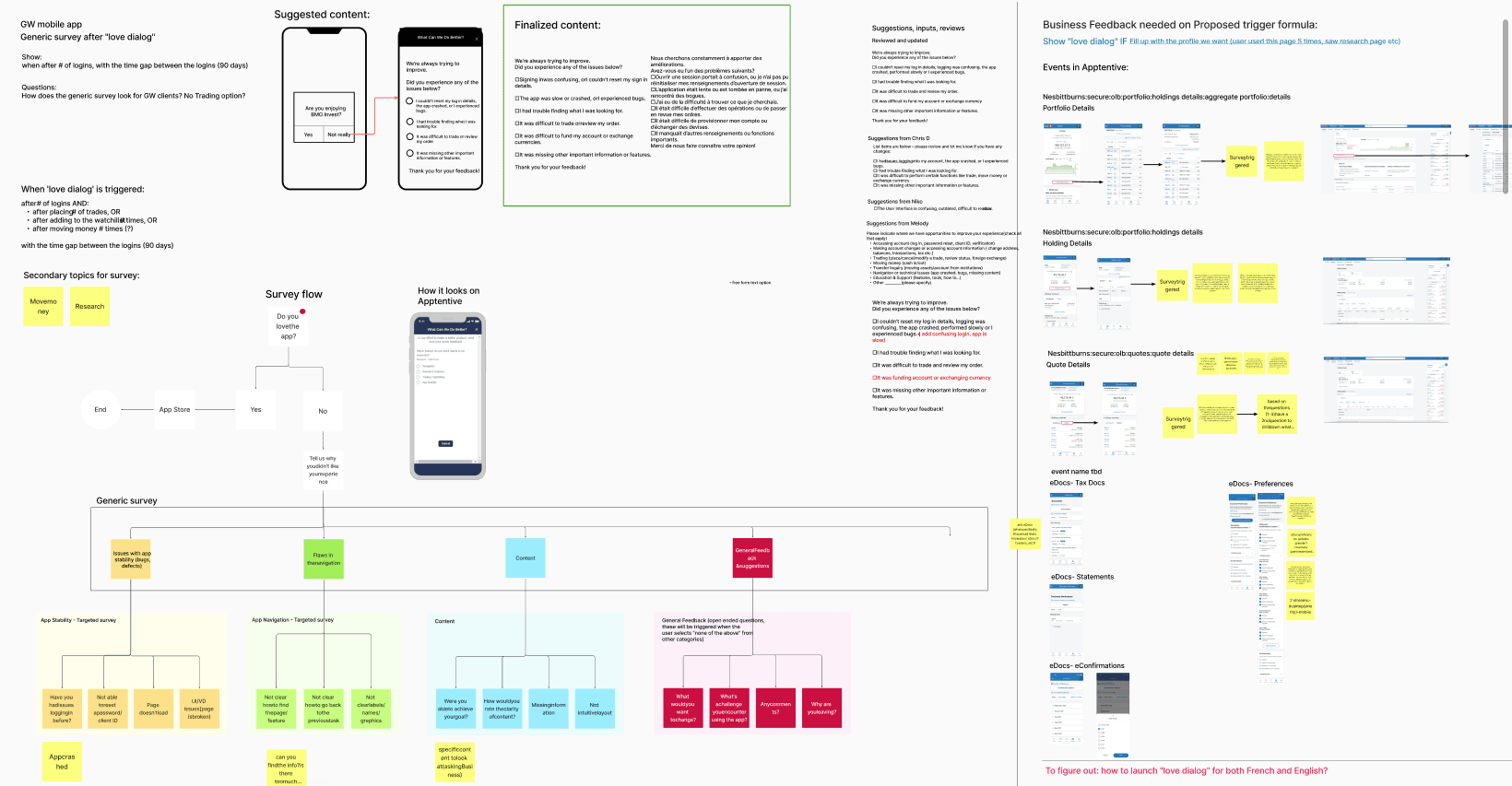
Event-based survey prompt used to gather in-context feedback without adding a heavy research layer to the experience.
Modernizing Document Retrieval
Reduce friction in high-frequency workflows
Edocuments Modernization
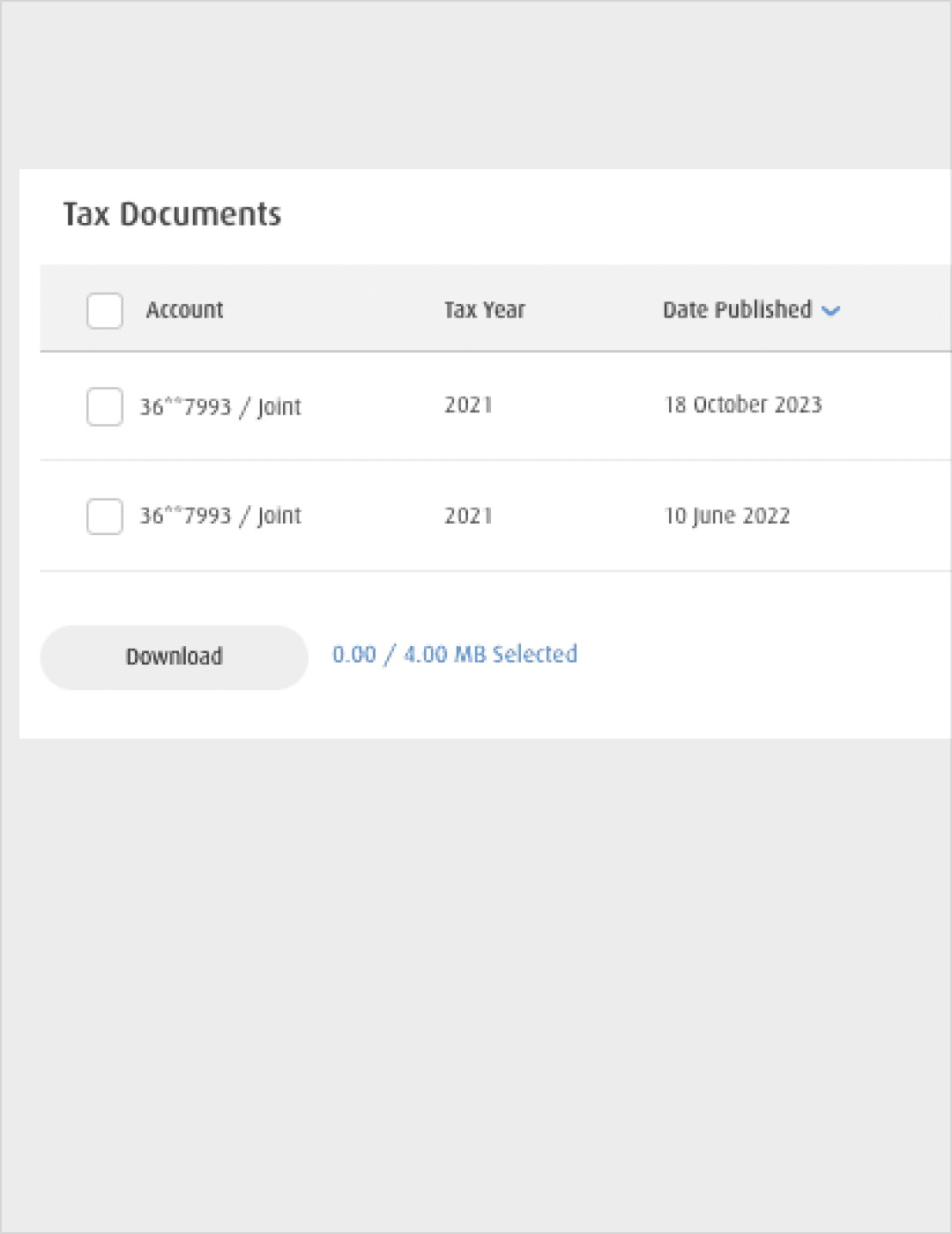
Legacy Interaction
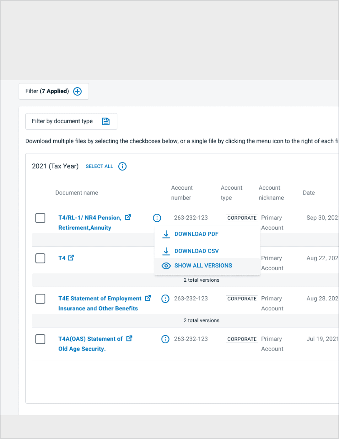
Simplified Document Retrieval
The original eDocuments experience supported document access but introduced friction when users needed to retrieve multiple document types across tax years.
The modernization focused on improving scannability, clarifying filtering context, and enabling clearer bulk-selection patterns while preserving familiarity for existing users.
- Introduced clearer document grouping by period
- Surfaced applied filters to improve state awareness
- Simplified multi-document selection patterns
- Reduced nested action complexity
- Improved keyboard navigation flow within document tables
The primary goal was reducing friction for high-frequency tasks, particularly retrieving multiple document types efficiently.
Improving Account Preferences & Delivery States
Clarifying document delivery and notification behavior
Improving Account Preferences
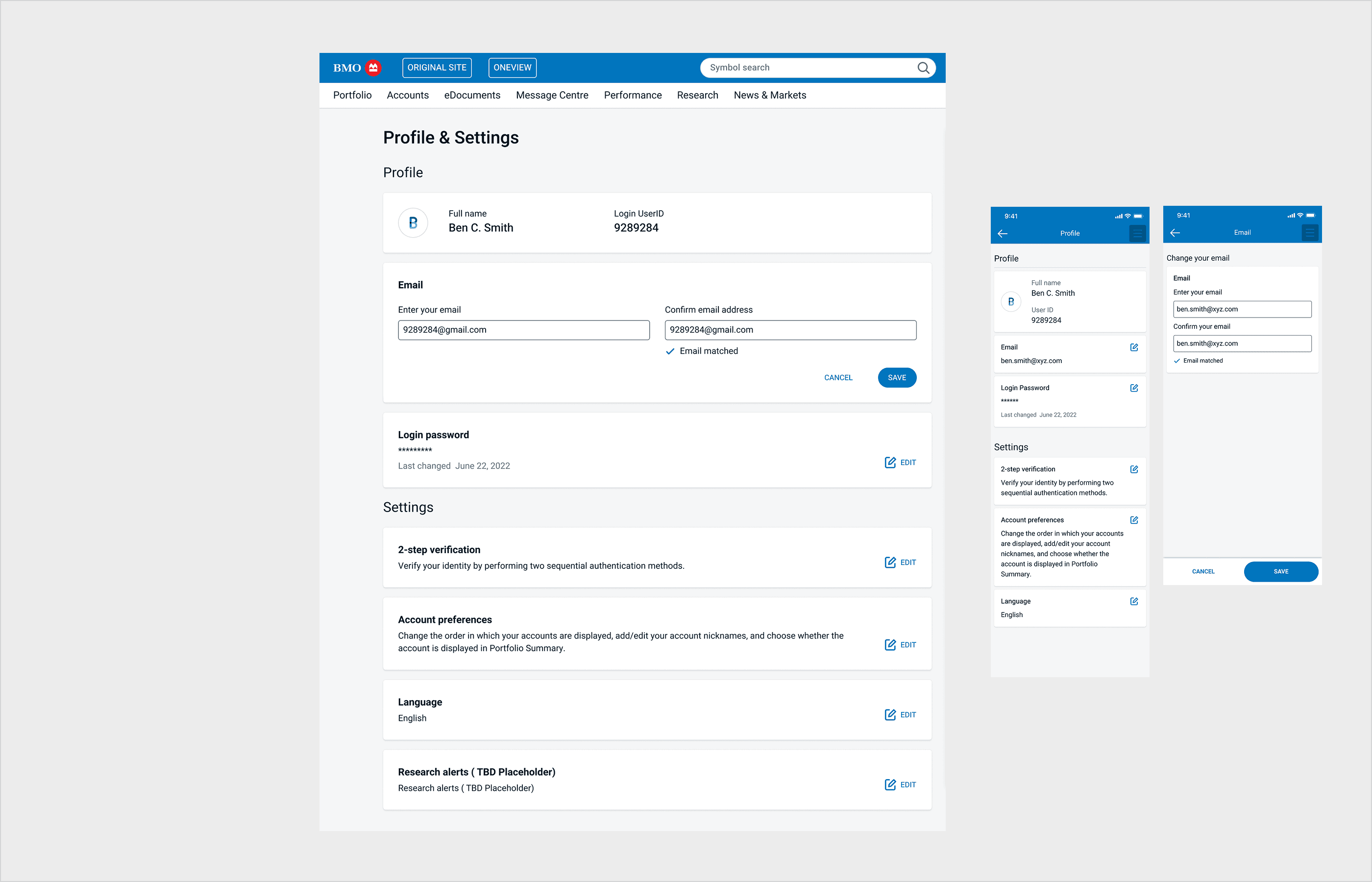
Account Preferences Interface
Delivery preferences and notification states were previously fragmented and visually secondary.
The updated interaction pattern clarified document delivery settings, surfaced alert states, and strengthened accessible form behavior across preference controls.
- Improved hierarchy of preference controls
- Clearer visibility of email verification and alert states
- Consistent interaction patterns across toggles and settings
- Reinforced accessible form structure and semantic clarity
Bridging Design and Production
Designing with architectural awareness
Working directly within Angular and enterprise CI/CD workflows strengthened how I approach system design.
Beyond visual refinement, I collaborated closely with engineering to ensure components were reusable, WCAG-aligned, and structured to scale within the broader platform ecosystem.
- Separation of presentation and business logic
- Component reusability and consistent state handling
- Accessibility compliance at production level
- Alignment between Figma intent and shipped behavior
- Supporting design system adoption to accelerate implementation
Impact
+63%
platform usage
71%
user satisfaction
Improvements to document retrieval and account preference workflows contributed to measurable gains in platform engagement and user satisfaction. Reducing interaction complexity and strengthening accessible component behavior improved clarity across critical financial tasks.
Reflection
Modernizing enterprise financial systems requires balancing stability with meaningful improvement. In this environment, success is not defined by dramatic visual change, but by reduced friction, clearer system behavior, and scalable component architecture.
Working directly within Angular and enterprise CI/CD workflows strengthened my ability to design with implementation constraints in mind. This experience deepened my approach to building systems that are both usable and structurally sound.